
Charting Tools for Context
Charts don't predict the future. They show where a stock's been and help confirm what your fundamental analysis already told you. For value investors, charts are a second opinion, not the main story. When used right, they help you enter better, avoid noise, and stay patient when price and value temporarily disconnect.
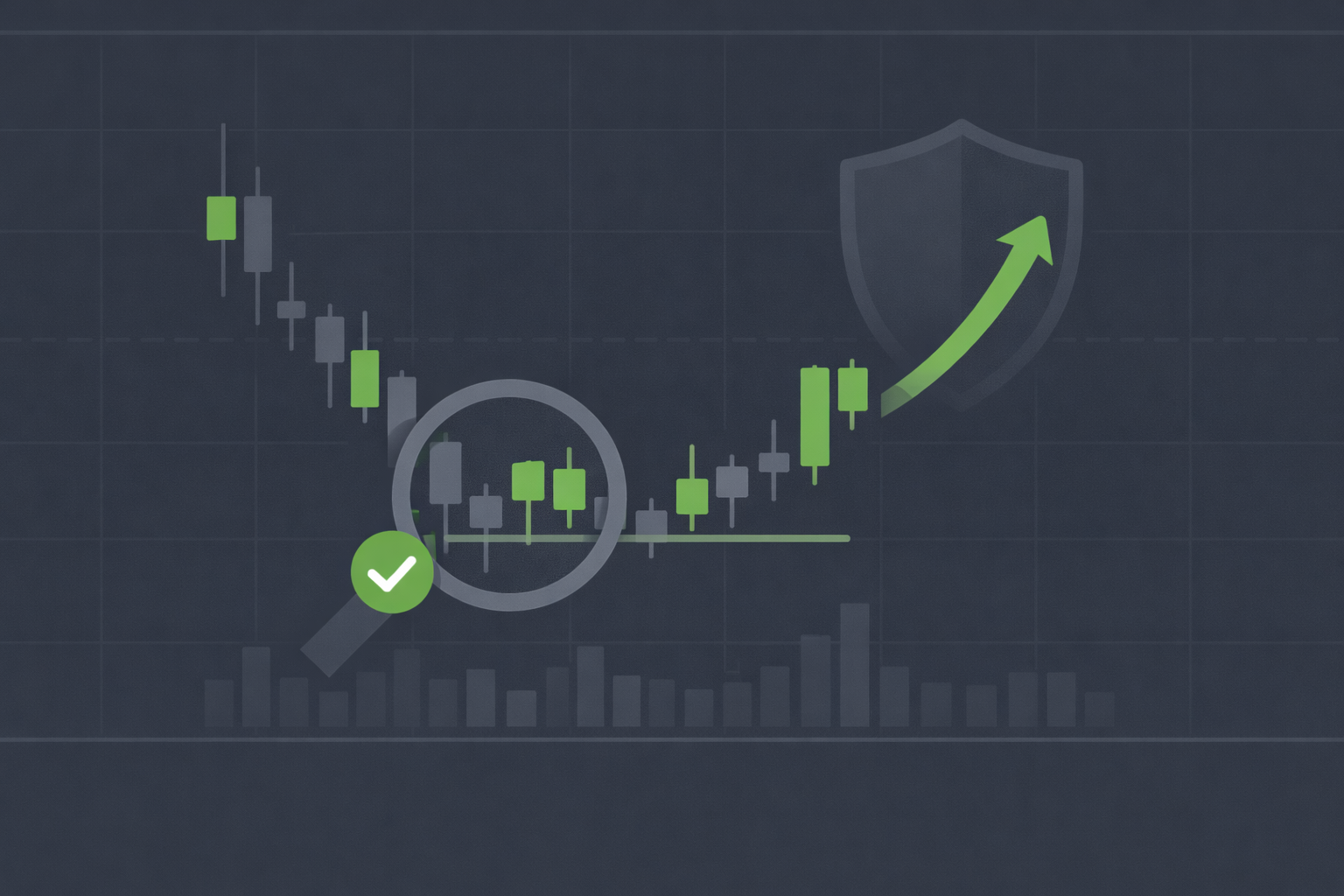
TL;DR
- Charts confirm, they don't predict: Use them to validate your valuation thesis, not to time trades or chase patterns
- Price vs. value awareness: Charts reveal when emotions have pushed price far from intrinsic value
- Better entry timing: Support levels and volume patterns help you buy at discounts within your margin of safety
- Emotional check: Seeing long-term trends keeps you calm during short-term volatility
- Simple beats complex: Stick to basics like price, volume, moving averages, and support/resistance
Why Charts Matter for Value Investors
Value investing focuses on business fundamentals: earnings, cash flow, balance sheets, and economic moats. Charts focus on price, volume, and patterns. At first glance, they seem incompatible. Technical traders chase momentum; value investors wait for quality at a discount.
But price matters, even to value investors. You can find a wonderful business trading below intrinsic value, but if you buy right before a 20% drop, you'll test your patience. Charts help you see where others are buying and selling, where panic creates opportunity, and when to be cautious even if the fundamentals look solid.
Think of charts as weather reports. You wouldn't plan a road trip based solely on weather, but you'd check the forecast before leaving. Same with investing: fundamentals tell you where to go; charts help you decide when to start the journey.
The Right Mindset: Confirmation, Not Prediction
The biggest mistake investors make with charts is thinking they predict future moves. "The stock just broke out above $50; it's going to $60." No, it might, but charts don't know earnings, management quality, or debt levels. They reflect collective emotions, nothing more.
Value investors use charts to confirm hypotheses. Let's say you've done your homework on "SteadyCo," and your valuation says it's worth $80, but it's trading at $60. That's a 25% margin of safety, worth considering. Before buying, you check the chart:
- Scenario 1: The chart shows a steady downtrend from $100 to $60 over 6 months, with low volume. This suggests weak interest, but also that sellers might be exhausted. If fundamentals are intact (no earnings collapse, no debt crisis), this confirms a good entry point.
- Scenario 2: The chart shows a sharp drop from $75 to $60 in two days on massive volume. This signals panic selling, possibly around an earnings miss or news event. You dig deeper before buying, did something material change, or is this an overreaction?
The chart didn't tell you to buy or sell. It told you to investigate further or confirmed your thesis. That's the difference.
Key Charting Tools for Value Investors
You don't need 50 indicators or exotic patterns. Value investors focus on a few simple tools that add context without creating noise.
1. Price and Volume
The foundation. Price shows what investors are willing to pay; volume shows how many care enough to act. High volume on down days suggests heavy selling (fear). High volume on up days suggests conviction (interest).
If SteadyCo drops 10% on low volume, it's likely drifting due to lack of interest. If it drops 10% on 3x normal volume, something spooked investors. You want to know why before buying.
2. Moving Averages (50-day and 200-day)
Moving averages smooth out daily noise and show trend direction. The 50-day average captures medium-term momentum; the 200-day captures the long-term trend.
When a stock trades below both averages, it's in a confirmed downtrend, which often means better entry prices for value investors. When it crosses above the 200-day after a long decline, it may signal renewed interest. This doesn't mean you should chase it, but it confirms that others are starting to notice the value you saw months ago.
3. Support and Resistance Levels
Support is a price level where buyers have historically stepped in. Resistance is where sellers have repeatedly shown up. These zones reflect psychological anchors: "I'll buy if it hits $50 again" or "I'll sell if it reaches $80."
For value investors, support levels help you set limit orders. If SteadyCo's intrinsic value is $80 and it has strong support at $60, you might place a buy order at $61, knowing buyers have defended that level before. If it breaks below $60, you reassess (is the business deteriorating?).
Resistance levels help with covered calls. If you own SteadyCo at $60 and see resistance at $75, you might sell a covered call at a $75 strike, collecting premium while knowing the stock rarely pushes past that level.
4. Volume Spikes
Sudden volume spikes flag important events. A 5x volume day usually means news: earnings, analyst upgrades, regulatory changes, or sector rotation. Value investors pay attention because these events can create mispricing.
If SteadyCo spikes on bad earnings guidance but the long-term fundamentals remain strong (temporary issue, not structural), the volume-driven selloff becomes a buying opportunity. The chart shows you when panic peaked; your valuation work tells you if it's justified.
5. Relative Strength vs. Benchmarks
Comparing a stock's price movement to the broader market (S&P 500 or sector index) helps you see if weakness is company-specific or market-wide. If SteadyCo drops 15% while the market drops 12%, it's underperforming, but not dramatically. If it drops 15% while the market rises 10%, that's a red flag, dig into fundamentals.
Relative strength charts help you avoid "cheap for a reason" traps. A stock can look cheap on valuation but might be declining due to competitive losses, regulatory threats, or management issues. The chart won't tell you why, but it signals "investigate deeper."
What Charts Don't Tell You
Charts have limits. They don't show:
- Earnings quality: A rising chart doesn't mean earnings are sustainable or real
- Balance sheet strength: A stock can rally while debt piles up
- Management competence: Price momentum doesn't reflect capital allocation skills
- Economic moats: A breakout doesn't mean the business has durable competitive advantages
- Intrinsic value: A chart can't calculate free cash flow or discount rates
This is why charts are secondary tools. If you're choosing between studying a company's 10-K or staring at candlestick patterns, read the 10-K. The chart can wait.
Combining Charts with Valuation
Let's walk through a practical example. You're evaluating "GrowthCo," a software company trading at $50. Your valuation (using discounted cash flow and earnings yield) suggests intrinsic value is $75, a 33% margin of safety. The fundamentals check out: strong moat, low debt, consistent free cash flow.
Before buying, you check the chart:
- Price action: GrowthCo traded between $70-$90 for two years, then dropped to $50 over three months. The decline accelerated in the last month (from $60 to $50).
- Volume: Volume tripled during the drop, especially in the final month. This suggests heavy selling, possibly institutional investors exiting.
- Moving averages: The stock is 30% below its 200-day moving average, the lowest point in 5 years.
- Support: Historically, GrowthCo found support at $55. It broke below that level last week and is now testing $50.
What does this tell you? The selling is real and intense, not just a slow drift. The break below $55 support suggests further downside risk in the short term. Before buying, you'd want to understand why institutions are selling. Did earnings guidance worsen? Is a competitor disrupting them? Is this a sector-wide rotation?
If your research confirms the business is fine (temporary headwinds, not permanent damage), the chart tells you to be patient. Wait for volume to dry up or for the stock to stabilize around $48-$50 before entering. You're still buying below intrinsic value, but you're not catching a falling knife.
When Charts Mislead Value Investors
Charts can create false signals, especially in low-liquidity or highly volatile stocks. Three common traps:
1. False Breakouts
A stock rallies above resistance on low volume, then immediately reverses. Beginners chase the breakout; value investors ignore it unless fundamentals justify the move.
2. Noise in Small-Caps
Small-cap stocks often have thin trading volumes. A single large order can spike or tank the price, creating chart patterns that mean nothing. Focus on fundamentals and ignore daily swings.
3. Overfitting to Patterns
Technical traders see head-and-shoulders, cup-and-handle, and double-bottoms everywhere. Value investors should be skeptical. Patterns work when they reflect real psychology (fear, greed, exhaustion), but most are just noise.
If you find yourself analyzing 5-minute charts or counting Fibonacci retracements, you've left value investing territory. Pull back to the fundamentals.
Popular Charting Platforms
You don't need expensive software. Most free platforms offer the basics value investors need:
- TradingView: Clean interface, easy to overlay moving averages, volume, and trendlines. Free tier is enough for value investors
- Yahoo Finance: Simple charts with volume and moving averages built in. Good for quick checks
- Your brokerage platform: Most brokers (Fidelity, Schwab, Interactive Brokers) include charting tools. Learn your broker's tools, they're usually adequate
- StockCharts.com: More advanced, great for comparing stocks to indexes or sectors
- Wall St Yardie (https://app.wallstyardie.com): Simplifies fundamental analysis and intrinsic value calculations, letting charts play a supporting role
What Could Go Wrong?
- Overreliance on charts: You start making decisions based on price action instead of business fundamentals, turning into a momentum trader
- Analysis paralysis: Too many indicators create confusion. Stick to price, volume, and moving averages
- Ignoring fundamentals: A "bullish" chart doesn't save a deteriorating business. Always prioritize balance sheets and earnings over patterns
- Mistaking correlation for causation: A stock that bounces at $50 three times isn't "destined" to bounce again. Support breaks when fundamentals weaken
- Short-term focus: Zooming in on daily charts tempts you to trade instead of invest. Stick to weekly or monthly views for context
To mitigate these risks, use charts for confirmation only. Ask yourself: "Does this chart change my valuation thesis?" If no, ignore it. If yes, investigate why before acting.
Next Steps
- Choose one charting platform (TradingView or your broker's tools) and learn the basics (price, volume, moving averages)
- Review charts for your current holdings: are they trading near support or resistance? Are volumes normal or elevated?
- For each new stock on your watchlist, check the 1-year chart before buying to see price history and volume patterns
- Set up simple alerts (if your platform supports it) for when stocks hit key support levels or break above/below moving averages
- Read Stock Screeners for Value Investing to combine fundamental filters with chart-based entries
- Explore Options Chain Analysis Tools to use charts for timing option strategies like covered calls and puts
*Disclaimer: This content is for educational purposes only and does not constitute financial advice. Past performance does not guarantee future results. Always conduct your own research before investing.*